Sales Reports
Analytical reporting is a crucial tool for understanding and optimizing business processes within an enterprise. To maximize its value, reports should be presented in a clear and easily interpretable format.
Visualization is the presentation of information in a form that is easy to perceive and interpret (graphs, tables, diagrams, OLAP cubes, etc.). It is used not only to interpret and evaluate the results of analysis but also at other stages of the analytical process: to evaluate the quality of data, put forward and test hypotheses, and monitor the process of constructing and operating analytical models.
To solve such problems, Megaladata provides Visualizers.
The examples below show how to set up reports in Megaladata to clearly present company sales data in various sections.
Algorithm Description
Initial Data
Table "Data load"
| Name | Caption |
|---|---|
| Client ID | |
| Client group | |
| City | |
| State | |
| Date of sale | |
| Amount with discount |
Data Clearing
The Data load table contains information about daily sales. Use the DateTime handler to extract the month from the original date.
In the Date Transformation (Month) node, specify the following settings:

As a result of executing the node, a new column will be added:
| Name | Caption |
|---|---|
| Month of sale |
Reports
To add a visualizer to a node, you need to click the Visualizer Setup button (appears when you select a node), select a visualizer in the window that opens on the left and drag it to the right side of the window, where the node port whose data can be visualized is displayed. The name of each report is also specified here.
To build a report, transform the source data. Use the Cross-table handler for this and set the following settings:
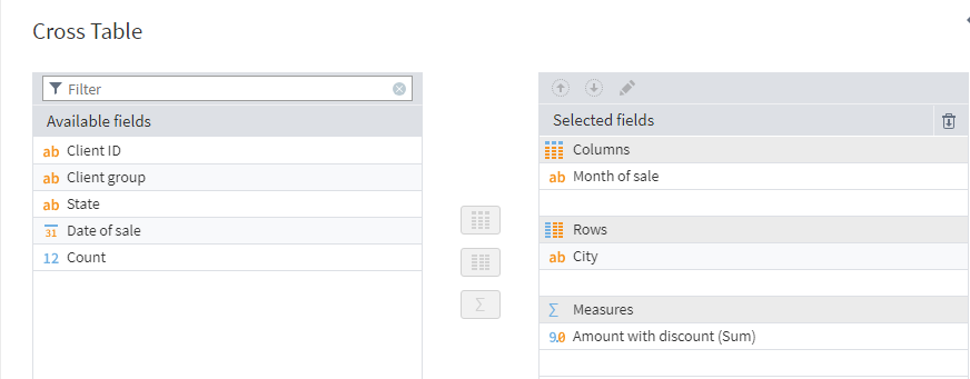
For this report, use the Statistics and Table visualizers.
In the Statistics visualizer , configure the display settings for the report indicators. Go to Configure Parameters and select the filters Minimum , Maximum , Average , Median , Sum , and Null count. Also, go to Configure Fields and exclude the City Field caption.
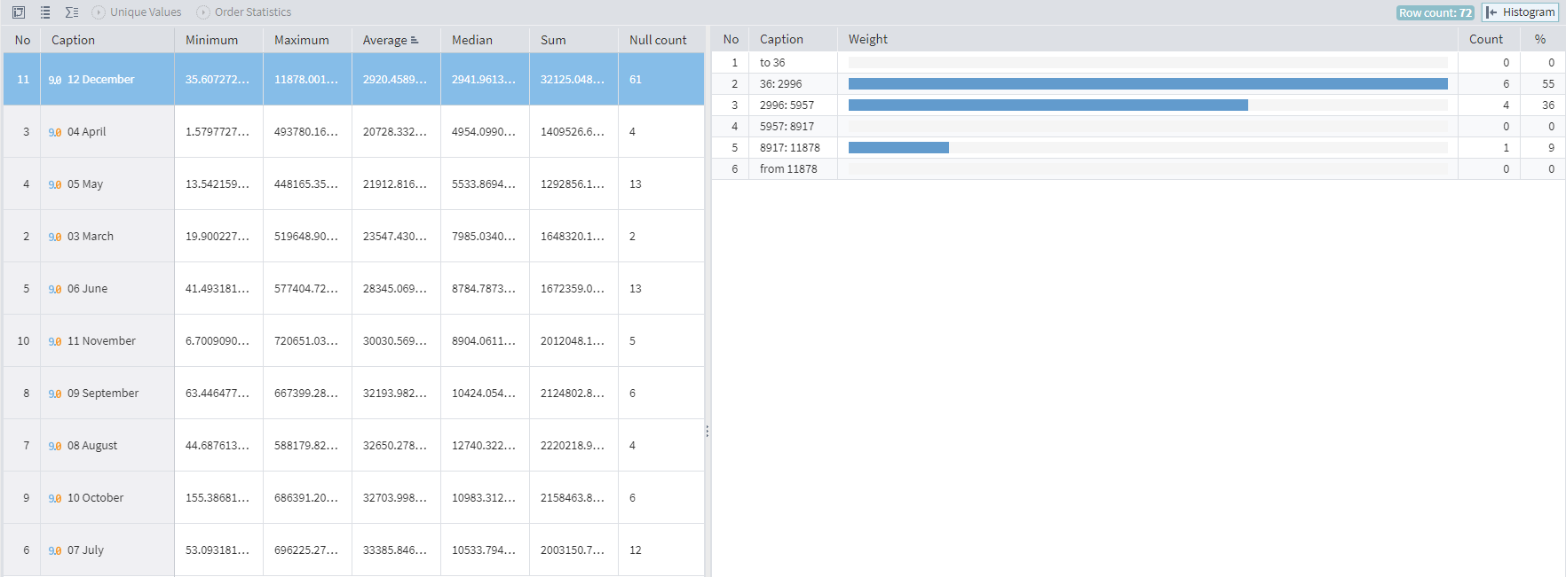
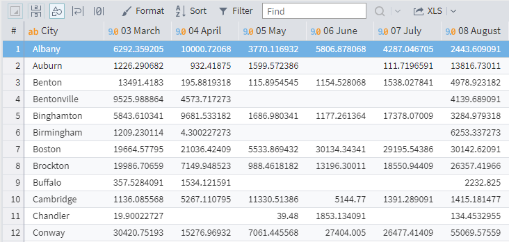
The Table visualizer does not require additional settings. The report is obtained in the form of a cross-table, in which you can filter and sort records. The report can also be downloaded for further work in xls or html formats:
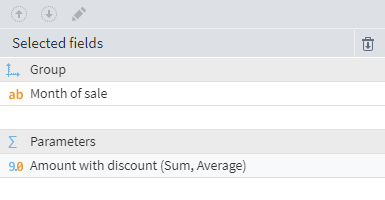
First, calculate the following indicators for each month using the Grouping handler :
- total amount of purchases
- average purchase price
Choose the following settings:
Generate a report using the Chart visualizer .
To do this, configure the following settings in the Chart visualizer :
- Use the Month of Sale field as the Label Field
- Move the Total Sales and Average Purchase Price fields to the chart plotting area.
- In General settings set:
- Tooltip type: Value
- Legend: Top
- In Series Editor set:
- Type: Splines (Main tab)
- Series Titles: Total Sales and Average Purchase Price (in the Series Name column)
- Axis: Right ( Additional tab ) for the Average Purchase Price
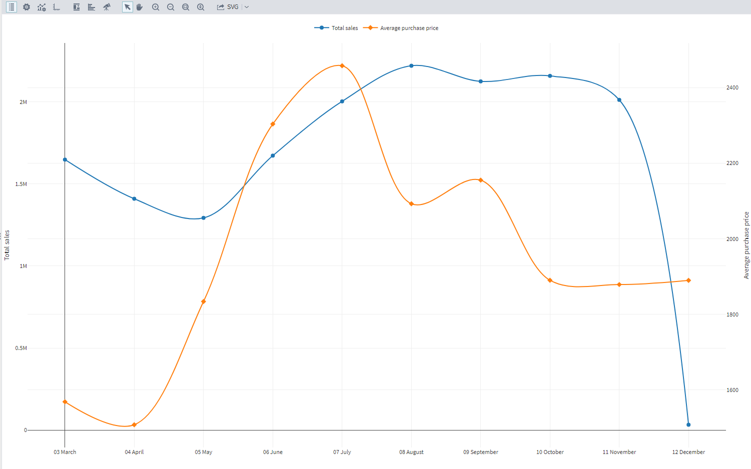
The report will show the dynamics of revenue growth by city relative to the first month.
First, calculate the monthly sales sum by city in the Total sales by city node. Configure it as follows:
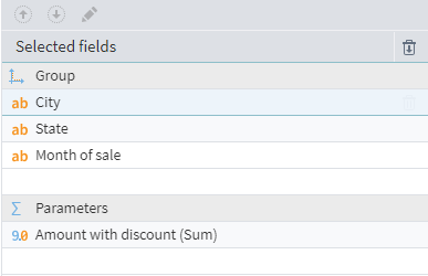
Build a report using the Cube visualizer .
When configuring a Cube, specify the following fields as dimensions:
- Month of sale - by lines
- City - by columns
- State - in the data filtering area (not displayed in the report, but can be used to filter data)
Set up filters by Dimensions :
Month of sale - exclude records for November and December City - exclude all records except Mobile and West Jordan
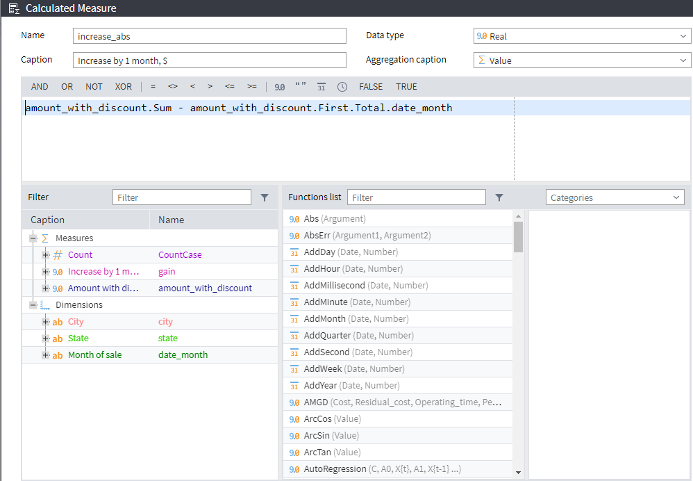
Add two Calculated Measures to the report
Increase by 1 month, USD:
Increase by 1 month, %:
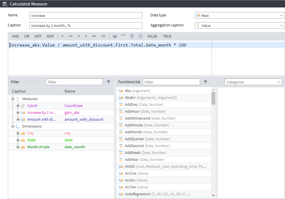
Use the calculations above as measures. Add them to the measures area.
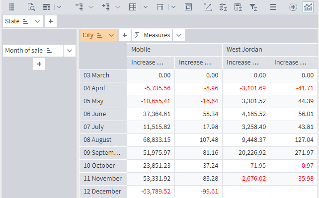
By setting sorting rules and filtering conditions, you can change the contents of the report.
The table can be transposed by selecting the appropriate command on the toolbar. When you transpose the table, the display of the chart will also change.
To display the Chart, click the Chart button on the toolbar . Configure the chart (the Chart Display Window toolbar) as follows:
- Series arrangement - In columns
- Select measures - Revenue growth by 1 month, USD
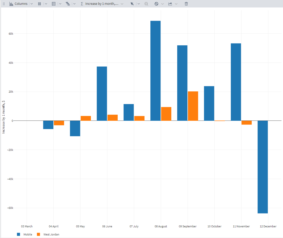
Commands on the chart display window toolbar allow you to change the chart type, the arrangement of series, and the measures displayed. The chart can be exported to various formats.
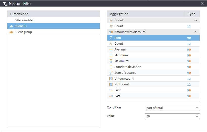
The report must display a list of clients whose sales account for 50% of the total revenue.
In the Key Clients node , exclude fields that will not be used in the report.
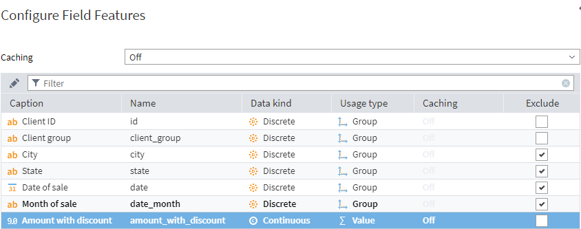
Build a report using the Cube visualizer.
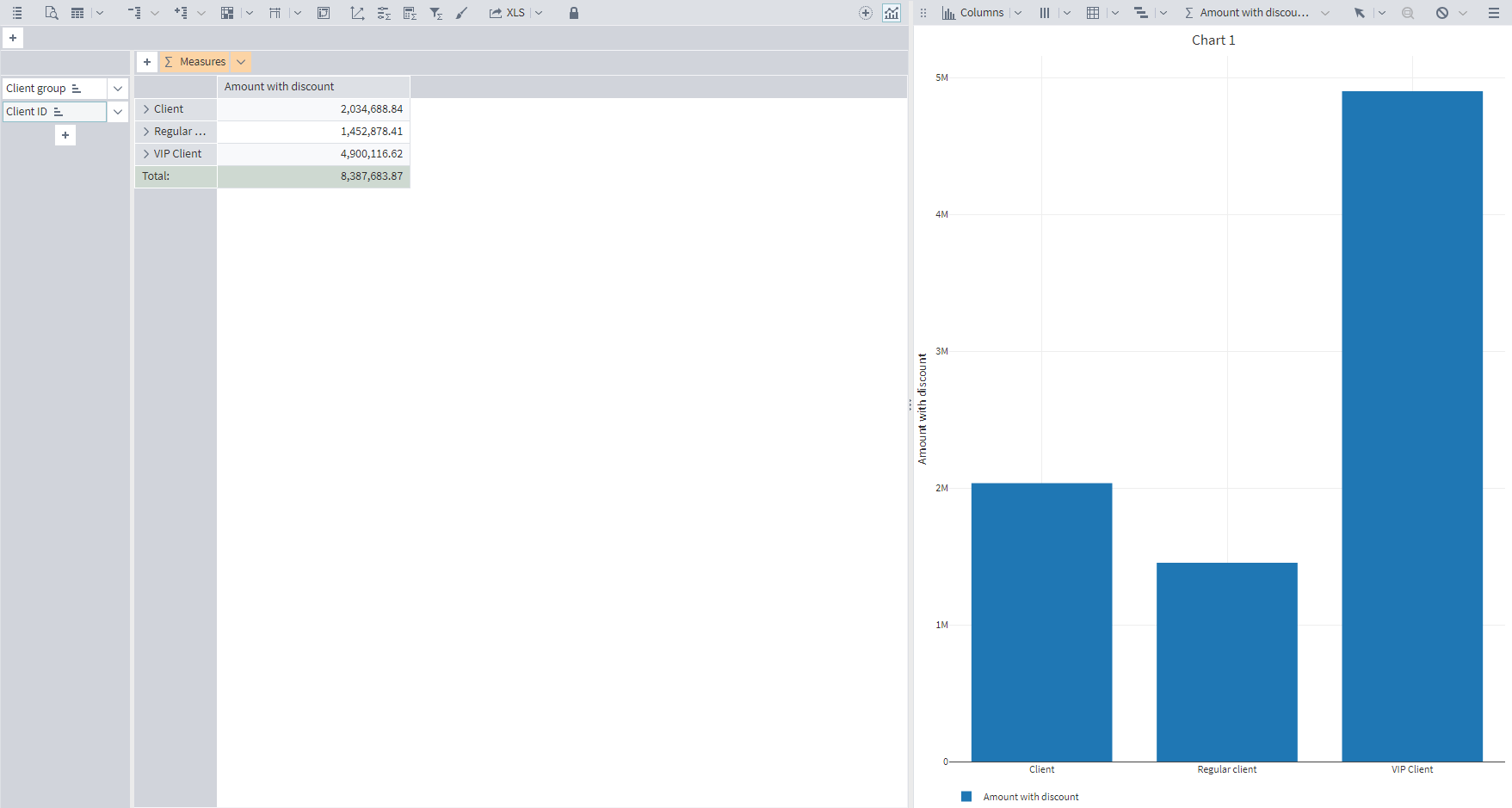
When setting up the visualizer, the following fields are set as Dimensions : Client Group and Client ID; as Measures — Amount with discount. In order for the report to display data only for clients bringing in 50% of revenue, a Measure Filter is set up , which specifies the client selection condition — share of the total amount 50%:
As a result, a report is generated that displays clients that generate 50% of revenue:
Download and open the file in Megaladata. If necessary, you can install the free Megaladata Community Edition.
